

Café Maison
Rebrand, Print & Packaging

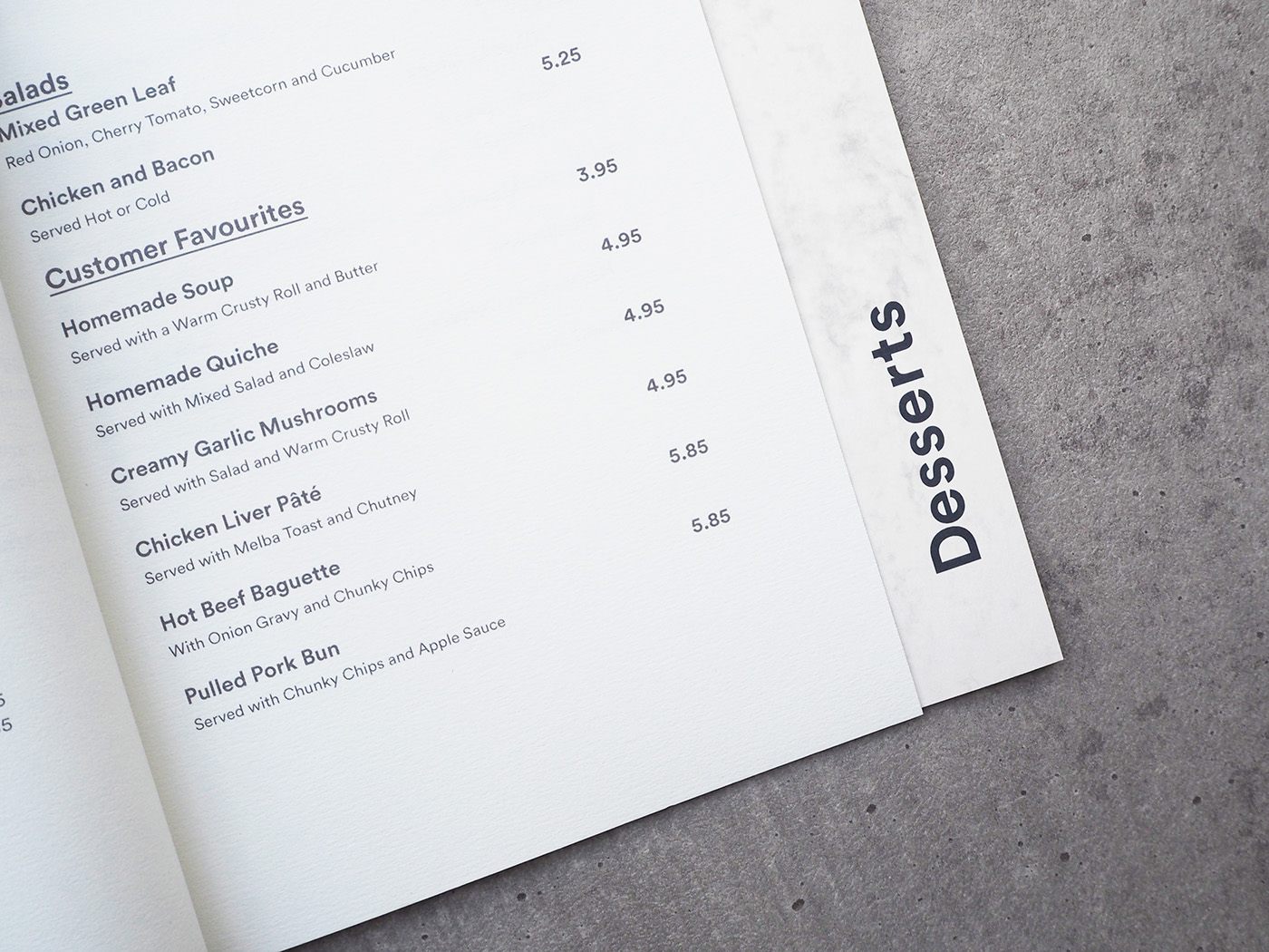
Printed Menu
The main aim of this branding was to create a new and up-lifting identity for the café to stand out against a street of direct competitors. We wanted to create something that was minimal and clean and a strong identity that could withstand a saturated market. We created a 10-page menu with a Japanese-Stab bind using GF Smith paper.


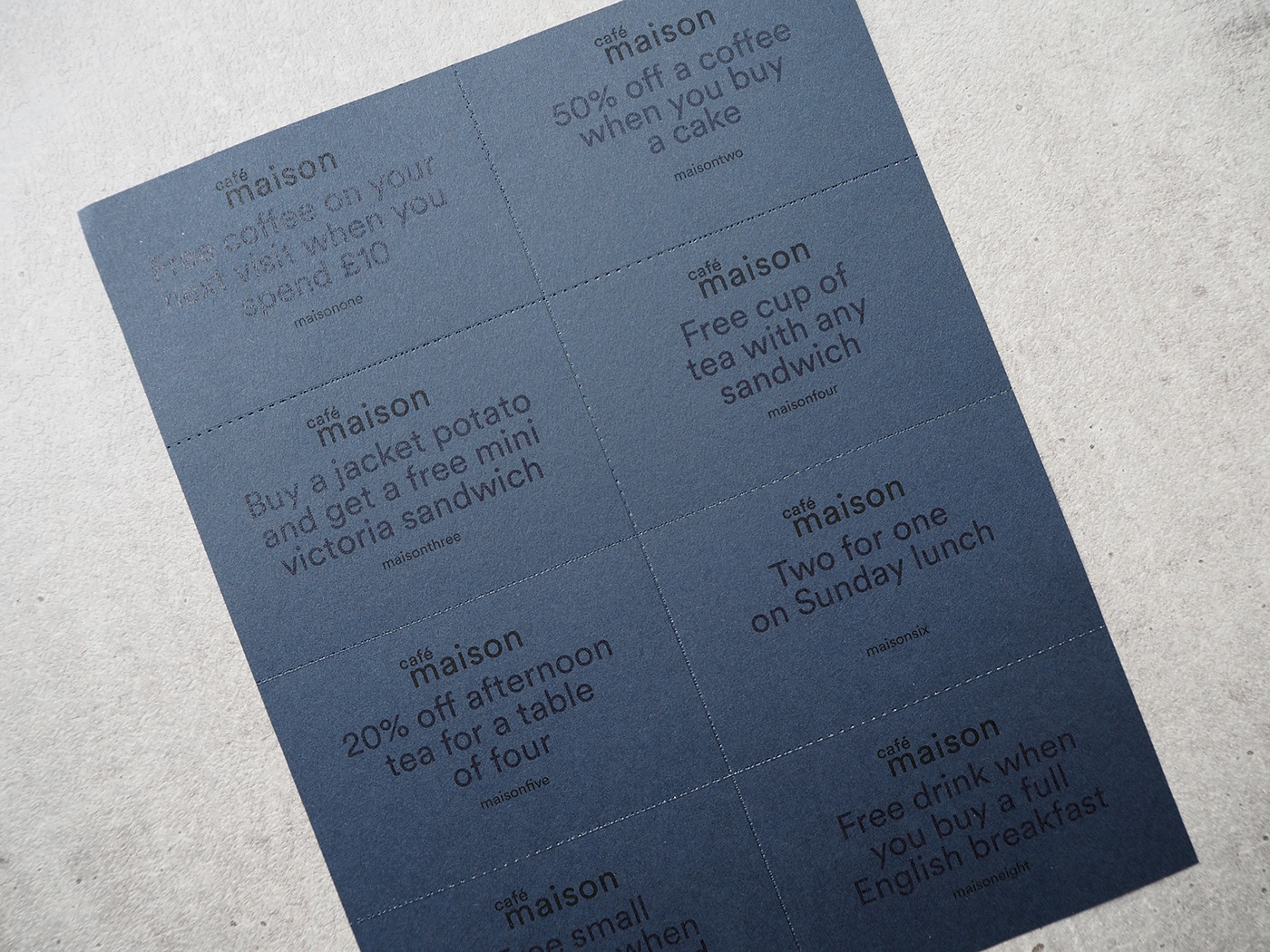
Printed Vouchers
Perforated 'tear away' coupons. Printed on 135gsm Imperial Blue GF Smith stock.


Brand Guidelines

Thank you


